Jonah
Grace
Cat Café Brand Identity
About Project
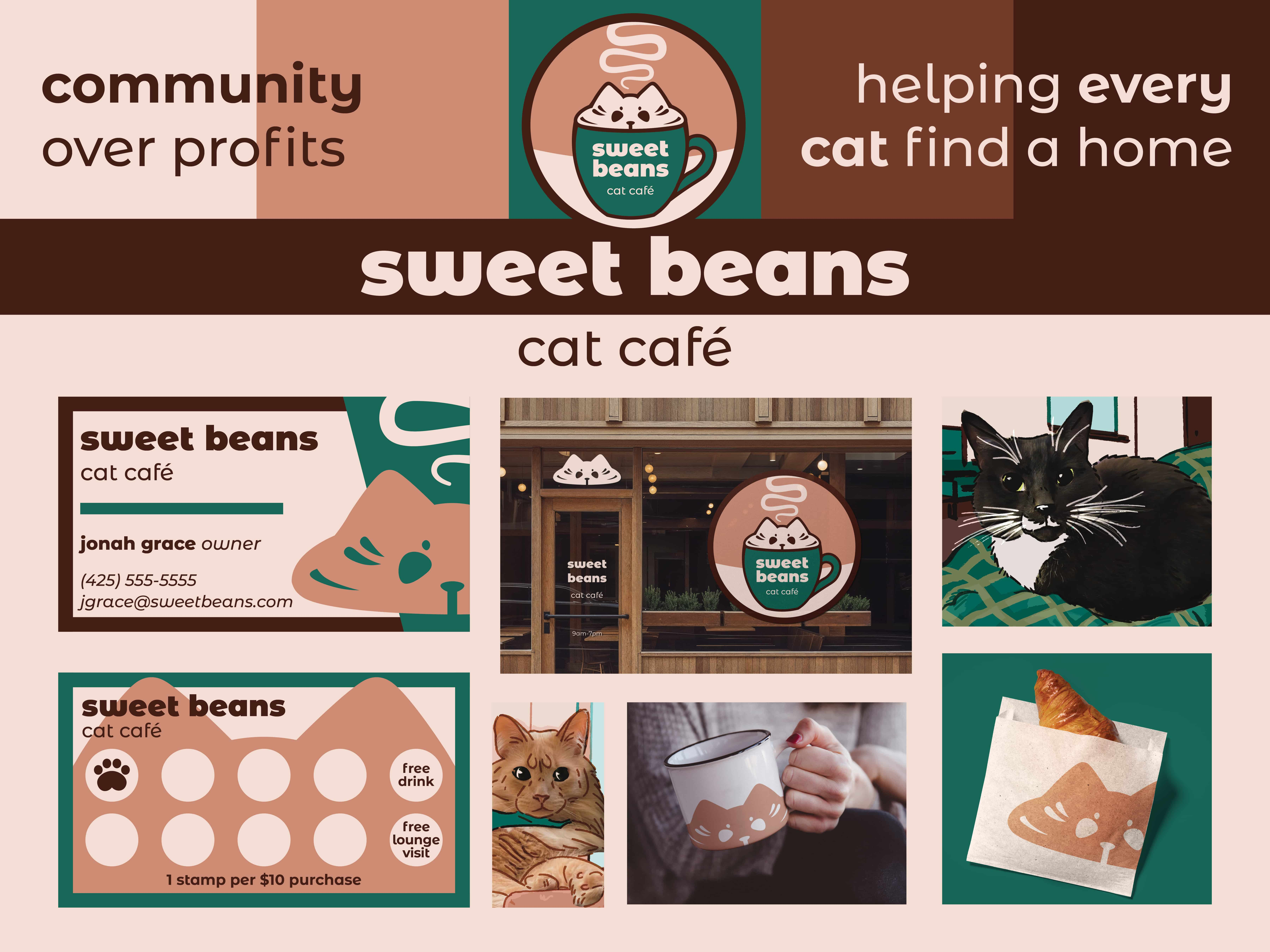
A proposed brand identity for a fictional cat café including logo, typography, imagery, and promotional/branded items. Geared towards typical café goers and cat lovers. Logo, typography, and color palette were designed to be clean yet cut and comforting, then utilized across various branded materials including business and loyalty cards, packaging, and posters.
In addition to the brand identity and the design of various promotional materials, I created a website for the café here.

Research
I began my research by analyzing the competition - other cafés, including both cat cafés and traditional cafés, as well as some local and national animal welfare associations, as organizations such as these would serve as collaborators to the café. Aesthetically, they are nearly identical - I as cafés having a "tried and true" technique of non-overstimulating, earthy tones, wood, natural lighting, a place where you can relax, study and work on a computer, and cats can play and nap...
Used my knowledge and observations from working at Starbucks, and also looked into their marketing strategy and brand identity - despite various controversies and coffee and food many find mediocre and far too expensive, Starbucks remains incredibly popular, especially as a sit-down spot. The ability to create such a welcoming environment is essential for a cat café. Reading articles about the psychology of cat cafés helped me formulate my ideas on creating a space as welcoming as possible.
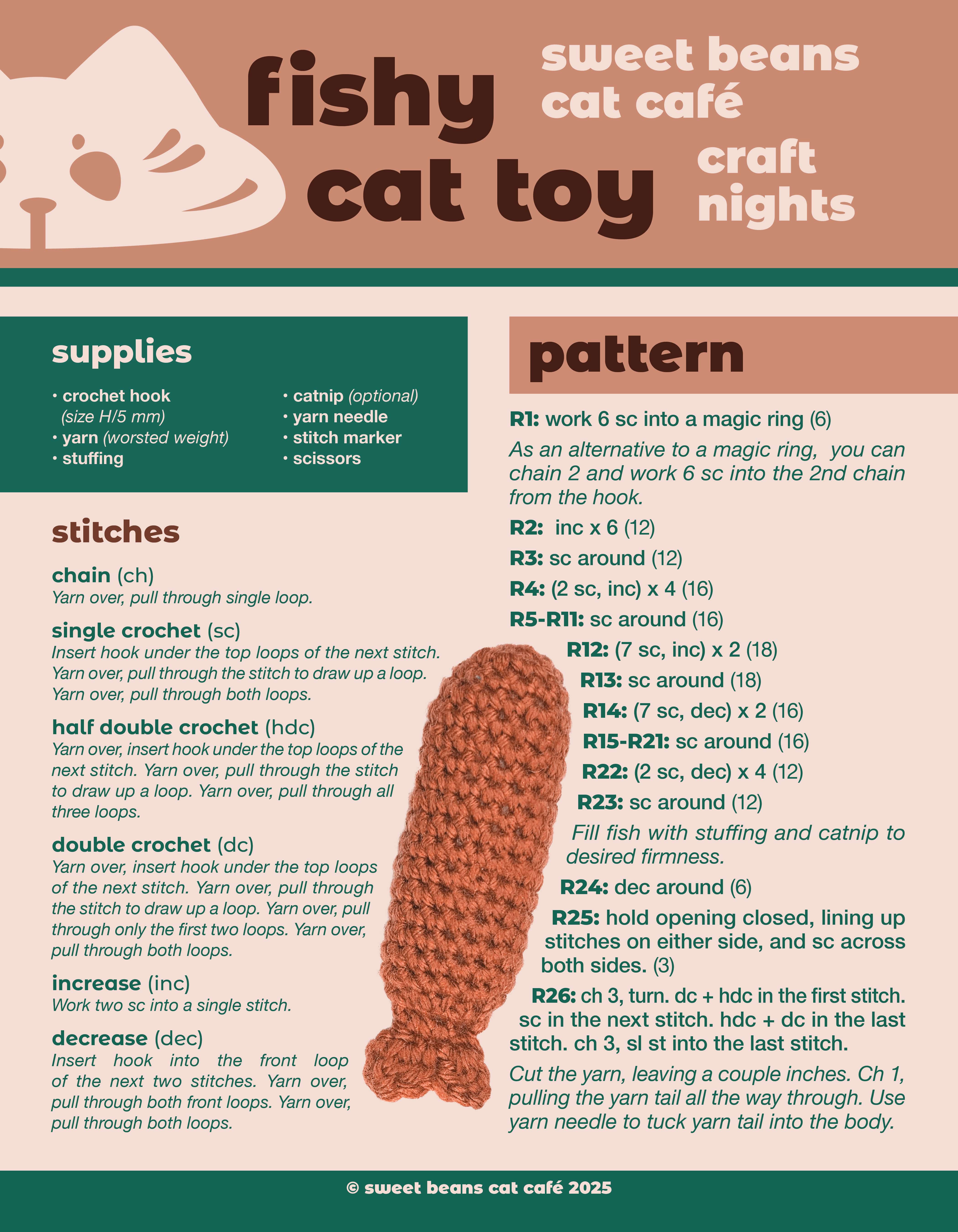
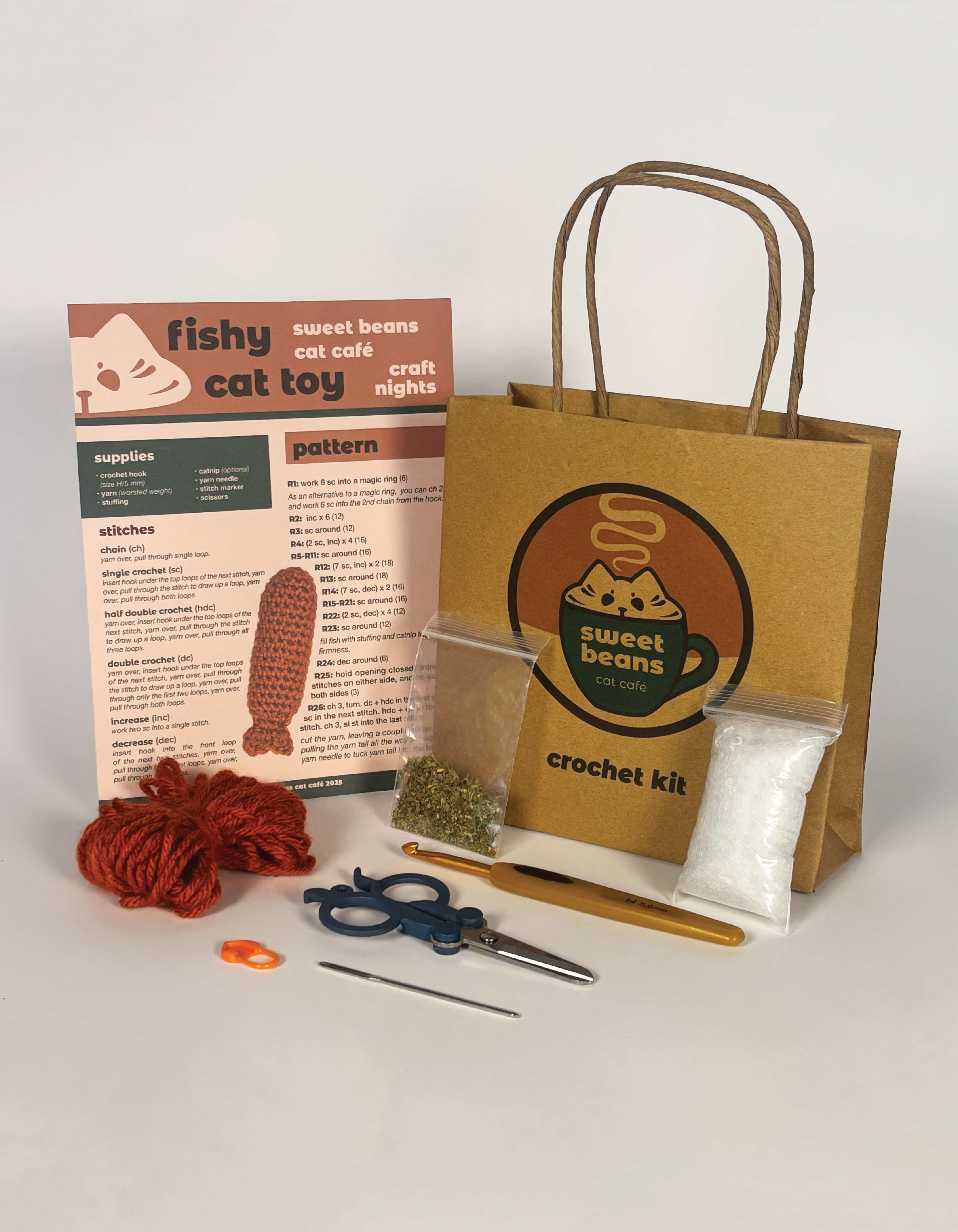
While scrolling through the websites and social medias of various existing cafés, I noticed many cafés hosting events, and delved further into that. With my knowledge of and passion for crochet, I began researching how to create my own crochet kit, similar to what The Woobles popularized.
Wanting to incorporate my illustration skills, I looked into concept and mockup illustrations for cafés and cat cafés as a possible direction to pursue. This also gave me further observations on cafés aesthetically. I did not end up going this route for my project but it was helpful to keep in mind as I envisioned my café.
Logo & Color
As always, I began with sketches. After choosing the name of the café, Sweet Beans - referencing both espresso beans and a cat paw's "toe beans" - I began brainstorming for a logo. I knew I wanted the logo to, of course, be clean and professional; however, it was also very important that it be cute. I knew from the beginning that I wanted to have stickers as part of the project, and I wanted to make sure my logo, as a sticker, was something that people would be attracted to and want to take and use. Of course, I knew I needed to incorporate a cat in some way, but I wanted the design to be obviously coffee-themed, too.
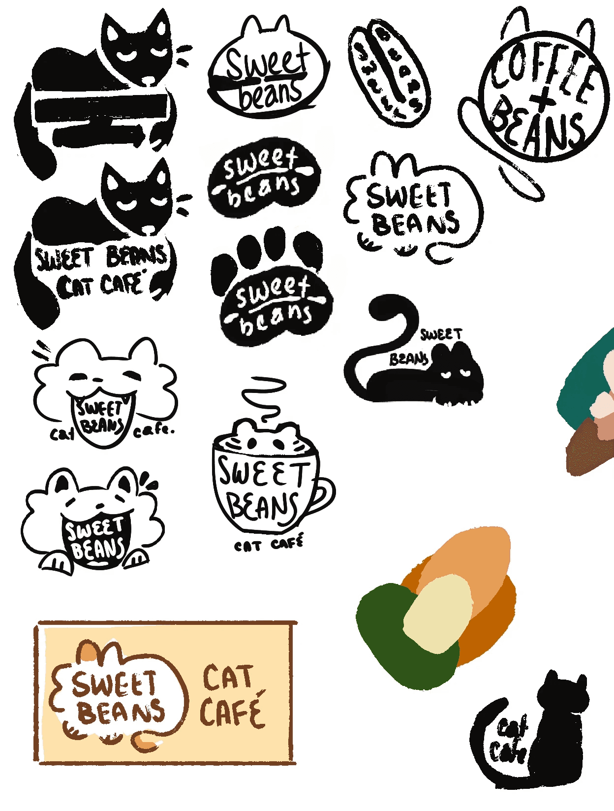
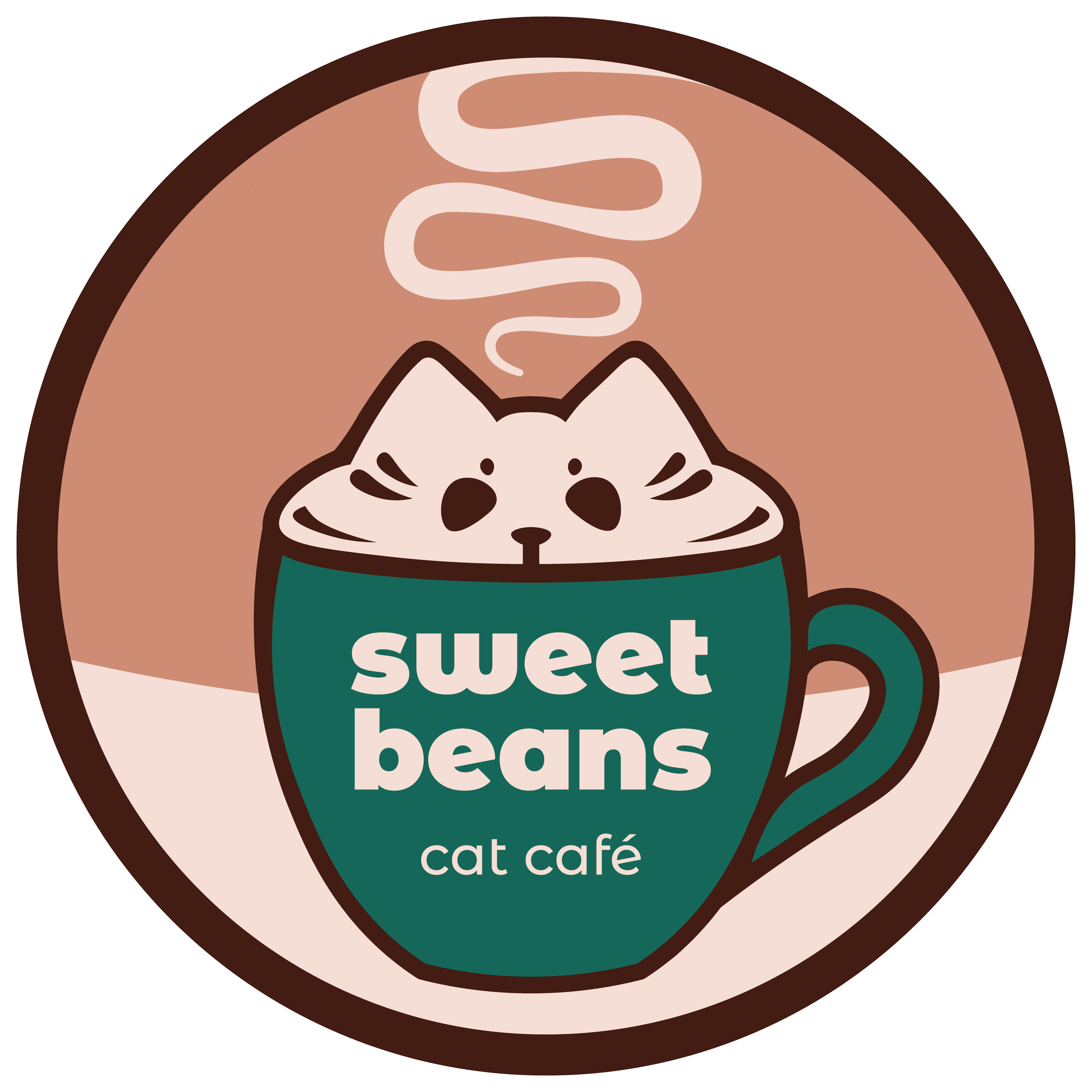
After sketching, I settled upon my idea for a cat in a mug, with just the head peeking out indexical of the milk foam at the top of a latte or cappuccino, while also bringing to mind the iconic "if I fits, I sits" cat behavior, referring to cats' preference for sitting in any sort of container they happen upon, as long as it's large enough for them to squeeze themselves into. Another aspect incorporated into my logo from early iterations are the lines in the face of the cat, iconic of both a cat's whiskers and giving more of a form and plushness into the "foam". While I certainly had logo ideas that were cuter, the one I chose to develop was definitely the most effective.
Typography
Next, it was time to tackle typography. As the font for headers and logo, I chose Montserrat Alternates, using the bold weight for the "sweet beans" and medium for "cat café" in the logo, and bold for headers. I chose this font because it's eyecatching and unique, yet very legible even at small sizes, and the thick, soft look matched what I was going for in the design of my logo and the feel of my brand as a whole - it's a very gentle, welcoming font. The uppercase of the font is a bit more of a display font, but I established lowercase type as a standard for all headlines and anything outside of body copy with periods.
Speaking of body copy, I chose Helvetica for mine - I knew I wanted a sans-serif that's easily legible, and Helvetica was perfect. It has the bonus of being available on practically every software, meaning the brand identity is easily replicable regardless of what software is being used.
Crochet Kit
As mentioned earlier, I had the idea to have a promotional event at the café, a craft night, in which people could come in and make their own crochet cat toy. As a crocheter myself, I set out to create a pattern that was as easy to read and beginner-friendly as possible, fully utilizing the limited space. I also created the kit itself, including the pattern, yarn, a stitch marker, a crochet hook, sewing scissors, a needle, stuffing, and catnip, all placed inside a branded paper bag I designed and assembled.

Promotional Poster
Now, I needed to figure out some promotional material for my café, as well as incorporate some illustrated visuals as I planned. I created four illustration/photograph mashups, incorporating my vision for the café as well as the color palette.
With those completed, i was ready to move onto my poster - I created a quick sketch and began designing the poster in InDesign, placing the cat illustrations in and giving them a polaroid photo-esque look, and using their photographs and promised appearances as enticement to prospective customers.